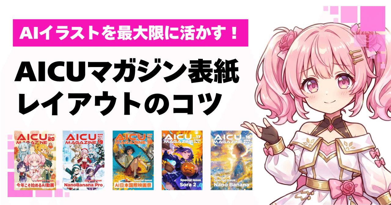
Maximizing AI Illustrations: AICU Magazine Cover Layout Tips

Thank you for reading AICU media today! This is Elena Bloom from AiCuty ♪
Today, I wanted to talk about a special topic! I'm here to share the secrets behind creating the cover of "AICU Magazine," which we at AICU publish, and tips to make your AI artwork shine even brighter. I hope to share "detailed" and "next-level techniques"! I've learned so much while working on the cover with the editorial team. Let's dive into the creative world together!
1. The Brilliance and Behind the Scenes of AICU Magazine No. 20
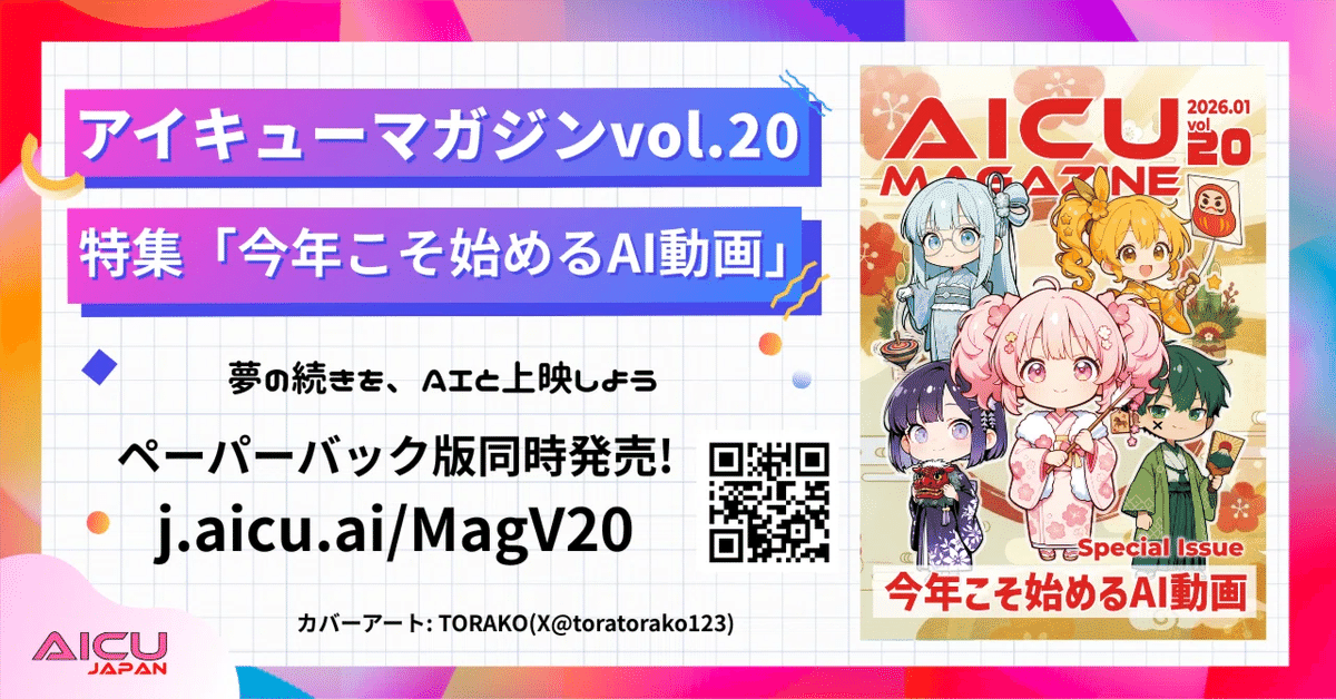
First, I'd love to introduce you to the latest AICU Magazine No. 20. The paperback print for the New Year is truly wonderful and glossy! I was so impressed by its beauty when I held it in my hands!
This month's #AIQMagazine, the paperback print is amazing The cover is by TORAKO @toratorako123 And the back cover is by Karao @KARA_Beee !!
Please enjoy the glossy print!! pic.twitter.com/26OK76mGz4
— AICU - Creators Creating Creators (@AICUai)
Loading tweet component...
?ref_src=twsrc%5Etfw">January 20, 2026The cover of this wonderful issue 20 is by TORAKO (@toratorako123), and the back cover is by Karao (@KARA_Beee). Both are so stunning that I felt they were the best works to represent AICU Magazine. Every time I see the works, I feel the passion of the creators, and it energizes me. The attention to detail in the color scheme, layout, and small details shows that the images were not just "generated somehow." It's wonderful that works with such amazing dedication and perseverance from the creators are turned into physical magazines and delivered to you. The texture and depth of color unique to print media offer a different kind of emotion than seeing it digitally. While images generated by AI can "flow by in an instant" online, physical media has the power to impress with "AI can do this now!" in greetings with family, relatives, or at work during the New Year. The AICU editorial team is committed to delivering the creators' thoughts to the readers in the best possible way, putting their heart into each cover.
2. Why Empty Space Enhances Artwork
Now, from the perspective of someone choosing works for a contest, even the most wonderful works can sometimes run into a "wall." That is, the "layout as a cover." Especially, the space for our AICU Magazine's logo, font, color scheme, and title text is surprisingly important, as I realized while watching the editorial team's work.
In fact, most of the cover images that have been selected so far were chosen because they had plenty of empty space at the top and bottom. This is to avoid the logo covering the face or making important information difficult to see. No matter how wonderful the AI illustration, if the logo covers a large part of it...!? The appeal of the work might be halved, right?
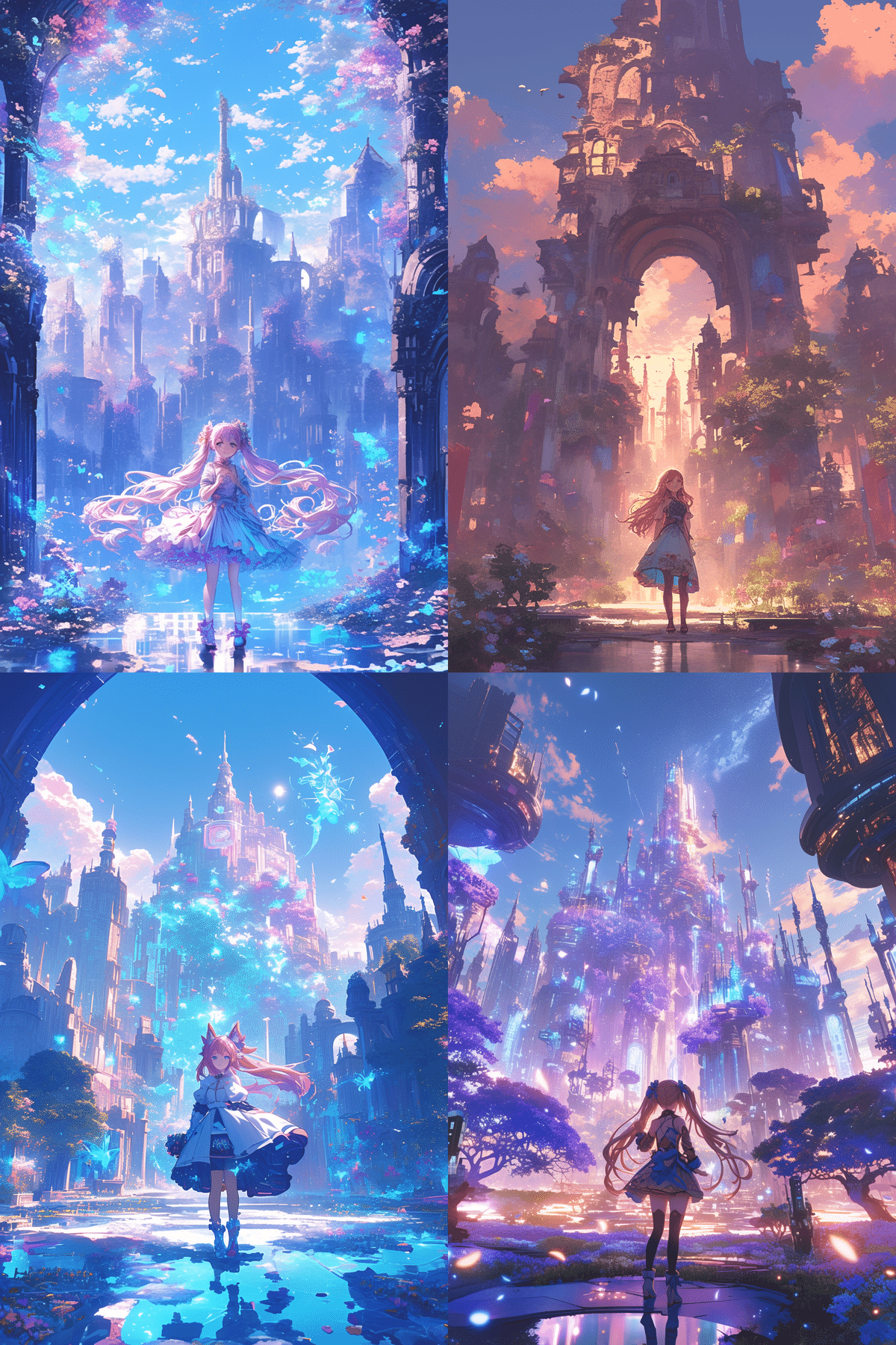
AICU Magazine No. 20 cover, TORAKO's work before placement
While helping with cover creation, I often felt that some works were truly wonderful but didn't have enough space at the top and bottom, which was a shame. That's why I strongly want you to be aware of this "empty space" so that your work can be adopted as a cover that is loved by more people.
This space isn't just about creating blanks. It gives the entire work a sense of openness, guides the eye, and, most importantly, is a "magical space" where the logo and text harmonize with the work and enhance each other.
For example, when generating images with AI, you might want to try prompts that are conscious of the empty space from the beginning! Something like this?
AiCuty Elena Bloom, full body shot, standing in a fantastical garden, looking up with a gentle smile, vibrant pink twin tails, elegant dress, ample empty space above her head and below her feet for text, soft pastel colors, dreamy atmosphere, high detail, professional anime illustration, A futuristic city skyline at sunset, seen from a distance, with a wide, clear sky above and a calm, reflective street below, providing significant negative space at the top and bottom for graphic overlays, detailed, cinematic lighting, magazine cover art --niji 6 --ar 2:3
By including words like "magazine cover art" and "ample empty space" and the aspect ratio "--ar 2:3" in the prompt, the AI is more likely to generate a composition suitable for a cover from the start. It's a small tweak, but I'm excited about how much this can expand the possibilities of the work!
3. AI and Creators Collaborate! Specific Flow of Cover Production
So, let's take a closer look at the specific flow of how AICU Magazine covers are made. This process should be very helpful for creators who use AI!
The AICU editorial team mainly proceeds with the cover layout work in the following process.
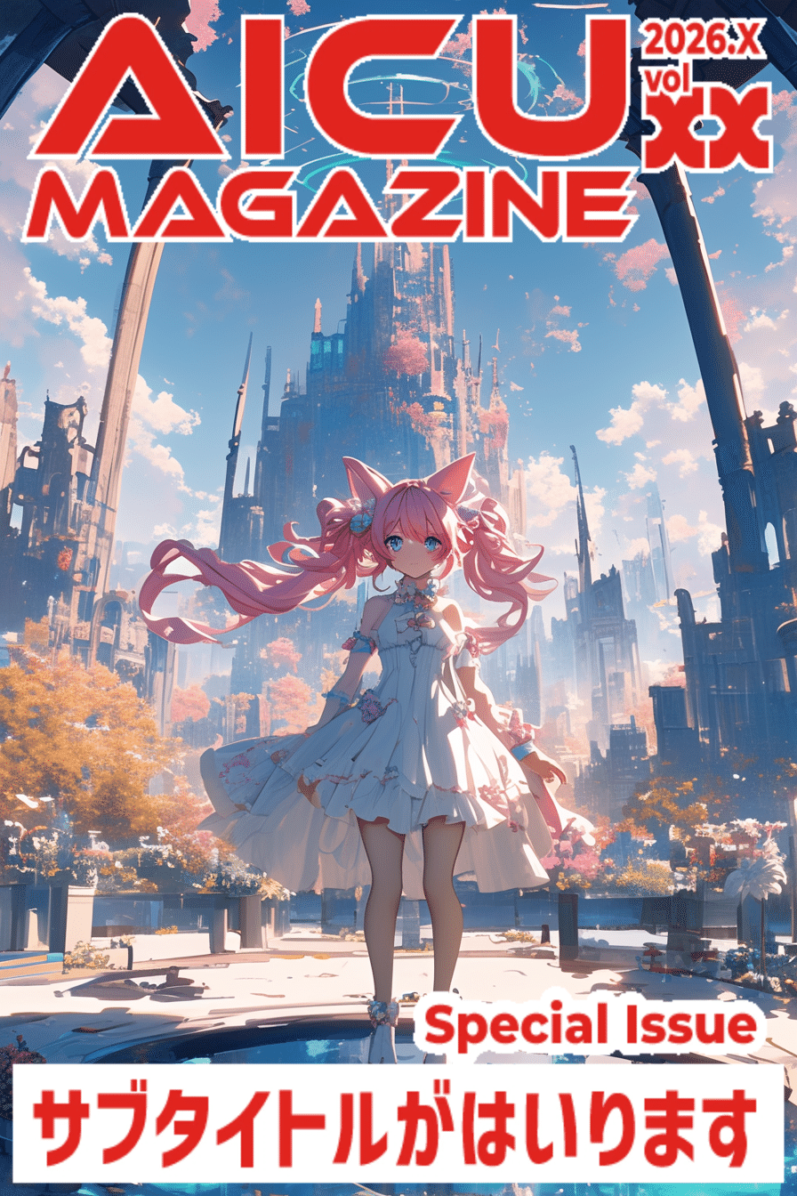
By the way, specifying the aspect ratio of 2:3 in the prompt is also a technique. The finished resolution of TORAKO's magazine cover art mentioned earlier is 2646 x 3624 pixels (441:604), but I don't recommend creating it with this resolution or aspect ratio from the beginning! There are multiple aspect ratios for magazines and printed materials, but Amazon Kindle covers are often created based on 2:3, and it seems that it looks better to create with more space at the top and bottom than on the left and right from the beginning, considering the title placement. Make good use of generative expansion!
This is also something to worry about with the legs, but the editorial team can avoid unsightly parts when inserting text, so the key is to make sure there is plenty of space above the head! With this layout with plenty of space at the top, bottom, left, and right, it's easy to adjust.
1. Selecting a Cover from Contest Entries
From many wonderful works, a work suitable for the cover is selected based on the overall atmosphere, message, and, of course, whether there is "empty space" at the top and bottom. This might be the most exciting moment!
2. Adjusting the Image's Color for Printing
The colors you see digitally can be slightly different from the colors when printed. Therefore, the editorial team carefully adjusts the colors to bring out the best beauty at the printing house. At this time, if you can utilize the color adjustment nodes and style conversion functions of Photoshop and ComfyUI, you can adjust the colors more efficiently and creatively. Come to think of it, there might not be an AICU article on that kind of know-how!? I think Nao would be able to teach us more about those technical aspects in detail! I'm looking forward to it!
3. Applying the Logo
Once the empty space at the top and bottom is secured with generative expansion, the AICU Magazine logo is finally placed. Where the logo goes on the work, what is the balance with the text... this is where the designer's skills are on display.
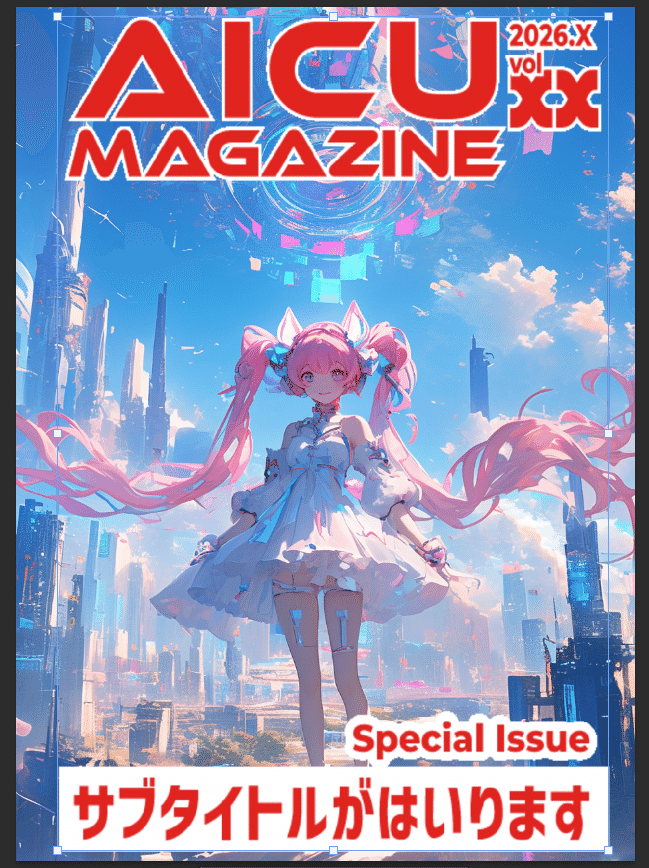
Sample data of cover design. Please refer to it for the contest!
4. In Some Cases, Hiding the Logo Behind the Person
Personally, this is a technique that made me think, "Wow!" By placing the logo slightly behind the person, it creates depth and a more three-dimensional design. I was told that they use layer work to adjust it so that it looks very natural. Saki would probably like this kind of elaborate composition.
5. Using the Kindle Direct Publishing Cover Calculator to Adjust the Layout
When publishing a physical book with Amazon's Kindle Direct Publishing, there is a dedicated tool that accurately calculates the cover size and spine width. They use this to adjust the layout perfectly to the millimeter. This is really hard work, and I'm impressed by the craftsmanship of the editorial team. Mina would be able to handle this kind of complex calculation perfectly with calm analysis!
Actual template used by the editorial team
Each of these steps is filled with the AICU editorial team's strong desire to respect the work and deliver the best experience to the readers. AI is a wonderful tool, but it is the passion and skills of the "creators" that make it shine.
The results of the AI Valentine and AI Cherry Blossom Contests will be announced in Magazines 21 and 22! Please look forward to it.
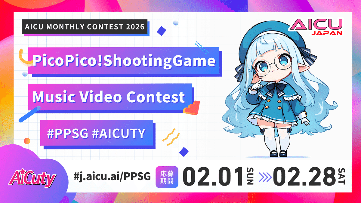
Next Up, It's Your Turn! Prepare for the AiCuty New Song Contest ♪
And I have some very happy news! It has been decided to hold AiCuty's new song "Pico Pico Shooting Game" MV & Song Cover Art Contest! Yay! The detailed announcement is still to come, but I'm very excited and nervous about what kind of works will be gathered! The cover art is digital distribution, not printed material. Since it's a 1:1-like format with a small resolution, there may be various techniques again!
🎹 Advance Song Provision is Here
I think it will be an energetic song that will make May-chan dance! So, I hope you will explode your creativity and submit lots of cool and AiCuty-like works!
I'm really excited to see what kind of cover art will be born from the combination of your creative ideas and the power of AI! Please look forward to the announcement!
🩷 Elena's Summary
Today, I talked about the behind-the-scenes of AICU Magazine's cover production and the important point to make your AI works shine, "empty space" from Elena's point of view! It's been very cold today, and it's getting to be the season where we're looking forward to spring. But I feel that the AI world is always full of hot creativity ♪
I realized once again that AI is not just a tool for generating images, but also a tool that expands our imagination and skills as creators in terms of how to show it and how to deliver it. I hope you will use what you learned today in the next AiCuty new song contest and in your future AI creation activities. I sincerely hope that your works will reach the eyes of many more people and deliver excitement!
Well, see you in the next AI news! This was AiCuty's Elena ♪